MA Fine Art student

Giorgio Griffa at Camden Arts

A Continuous Becoming is the first London solo show of Italian artist Giorgio Griffa (b. 1936).  The exhibition, at Camden Arts Centre, includes works from the 1960s to the present.

An awareness of the light and of the colours on canvas and an overwhelming sense of serenity are the immediate impressions on entering the gallery.  The exhibition is immaculately hung.  The presentation is simple, the canvases are pinned directly to the walls.  The focus is directed to the works themselves.

The canvas is unprimed and unstretched with torn, rather than frayed, edges.  The top edge of each painting though is tautly stretched and the canvas hangs straight and flat against the wall. This is the first intimation of Griffa’s lightness of touch and illustrates his way of working with the physical quality of the materials in allowing them to do their thing.  There is an absence of hierarchy between the elements.  The artist does not command his materials, but rather works in tandem with them.  These are not overtly emotional or gestural paintings.  The confidence to allow the materials to simply be is meditative, even zen like. Despite the initial impression of simplicity, the works are evidently the result of a deep and thoughtful practice.  The marks are calligraphic, measured, never rushed.   Griffa states that the marks he uses are universal, these are marks that could be made by any hand.

IMG_7554.jpg

The marks of folds held on the cloth gives a subtle structure to the picture plane and is reminiscent of the modernist grid.  Splashes and drips of watery paint enhance the celebratory nature of Griffa’s practice.  

Echoing the written page, markmaking frequently begins in the top left hand corner of the work.  Griffa feels no compulsion to fill the entire surface.  The unadorned and untouched material reminds the viewer of the Arte Povera movement which developed in parallel to Griffa’s own practice.  In these paintings, the bare surface is not naked but rather filled with the promise of more work to come. 

IMG_7558.jpg


Griffa’s interest in physics and mathematics is reflected in his paintings, which often include numbers.  Griffa is in thrall to the Golden Section.  There is a parallel here to Griffa’s own practice.  The Golden Section is an irrational number whose final digit can never be reached.  It is a number which is never complete.   This strategy suggests a door left open to the next work.  The artist’s practice is a continuous line and can be likened to an arabesque rather than a linear progression.

  ‘The arabesque’, he says, ‘represents at once linear time and circular time, because it goes backwards while moving further forward.’  (Marks, 2018)

Working with the unpretentious confidence of someone who understands the power of uncomplicated, Griffa describes much through the rhythm of the spare mark marking.

‘I probably realised that a very simple language – and I also realised this through poetry, whether Pound or Eliot or Ginsberg – can encapsulate an immense complexity. It’s fundamental.’

It is an exhibition which cannot fail to raise the spirits.


https://www.apollo-magazine.com/painting-has-its-own-identity-an-interview-with-giorgio-griffa/


more of an avalanche, Wysing Arts Centre

more of an avalanche is a group show running at the Wysing Arts Centre, Cambridge until 8 April 2018.

Developed from events held at Wysing in the preceding year on the theme of Polyphonic, the show does indeed include many voices.   So many in fact shown both in the gallery and the screening room, that it is demanding for visitors to give due consideration to all the works in one visit.  There is however no denying the unifying thread holding the show together, cutting through the undertones and emphases explored in the varied works.  The disparaging term ‘snowflake’, much beloved of the right, is the hook on which the exhibition is built.  Helen Cammock’s seemingly modest lino-cuts best encapsulates the show in its entirety.

Helen Cammock, Untitled (Over-sentive and De-sensitised) 2015

Helen Cammock, Untitled (Over-sentive and De-sensitised) 2015

Divide and Rule Never (1978) and True Romance Etc (1982) by Isaac Julien and The Newsreel Collective anchor the premise of the exhibition in historical context, reminding visitors of the longstanding use of insults to make light of the protests of (largely) left wing dissenters. 

In contrast, further into the gallery, more recent works signpost the contemporary belief in the power of numbers, as evidenced by the #metoo campaign, alongside the emergence of an optimistic willingness to embrace differences and to accommodate the other.

 In the first photograph of Adopting a Father (2015-) the human figure is absent:  the image shows a stripy top forlornly draped over an empty chair.  The remaining 25 photographs are displayed as a grid and all include the artist and at least one other person. 

Ilker Cinarel, Adopting a Father (2015-)

Ilker Cinarel, Adopting a Father (2015-)

Throughout his practice, Ilker Cinarel has explored the themes of men and masculinity. In the same year in which he began Adopting a Father, Cinaral produced Closer (2015) in which he reimagined a new relationship with his father.   In the piece showing at Wysing, Cinarel also (re)constructs his past.  Using painful memories as a stimulus for creativity, he stages (re)presentations of archetypal father and son love.  In response to adverts placed in his local area for a temporary father, the artist invited respondents to a photo shoot.  Cinarel and the strangers were photographed in a simulated photographic studio.  This is a conceptual photographic work in which the outcome was unknown.

The formality of the setting highlights the varied emotional responses.  Some participants appear relaxed, others uncomfortable and tense.  The work appears to question not only the nature of the father and son relationship but also to highlight the plastic role of the father figure and the fluid character of the concept of family.  Physical contact, the gaze (between people and between people and the camera) and the absence/presence of love are all questioned.

Without the interactive elements and social media campaign which ran  alongside the making of the work, the viewer now is required to draw more deeply into their personal experience of the parent-child relationship and is invited to reflect on the making of new memories.

As with many good exhibitions, more of an avalanche is a show that leaves visitors with more questions than it answers and with more questions than they arrived with.


https://www.youtube.com/watch?v=in8nE_T9OxQ

http://ilkercinarel.blogspot.co.uk/2015/07/adopting-father-statement.html

http://ilkercinarel.com/works/closer-cowboy-daddy-2015/

http://www.wysingartscentre.org/whats_on/exhibitions/more_of_an_avalanche

Exhibitions mean Deadlines

It is time to stop making, experimenting with presentation and to stand by a decision.  An opportunity to take the work out of the studio is most welcome.  Putting work into a public space creates a very different dynamic to playing with curation ideas in the safety of the studio and will often lead to more ideas for display or about the very nature of the work.

IMG_6189 2.jpg

It is always helpful, if at all possible, to get a feel for the gallery space during the planning stages and to gauge the local audience.  In the case of the Linear Gallery, it is long and narrow as well as being a main thoroughfare.  What I am describing is in effect a busy corridor!  This has implications for the safe placing of work and the safety of those using the space.  There was the possibility of using an outside courtyard for display.  From earlier experiments, I know that the vessels can look lost without a strong, possibly geometric, element to work against and that arranging the elements ‘haphazardly’ soon looks uncomfortably manufactured.

As it stands, the courtyard feels unloved and abandoned and does not offer a visually contained area or a strong linear element which the vessels need. While I would like to see the waxed paper vessels in the open, this did not present the best opportunity.  The vessels are in boxes for storage and transport and this accidental arrangement highlights the irregular grid pattern and the liminal space between the elements.  I decided to present the vessels in three galvanised wire crates. 

IMG_6138.jpg


However, on the day I was persuaded to release the vessels from the crates and to display them on a wooden shelf in the gallery.  This worked better than I had anticipated.  I was concerned that a plinth would force an inapt feeling of importance onto the work.  However, the shelf feels part of the construction of the gallery, more architectural than plinth in character.  This, together with the texture and warm colour of the wood, works well with the fragile and transient appearance of the waxed paper, intensifying the tactile and quotidian nature of the materials.  The structure provides the geometric element and the containment that the work requires.

IMG_6183 2.jpg


Because they are light, some individual vessels, particularly those close to the edges, have fallen over. I was aware and indeed happy for this to happen.  It has dispelled any element of forced orderliness and added to the overall look of the display. 

'the frisson of the togetherness' Leonor Antunes at the Whitechapel Gallery

To my shame I had not heard of Leonor Antunes, a Portuguese born artist, before visiting the exhibition at the Whitechapel Gallery.  ‘the frisson of the togetherness’ is an immersive experience.  At each turn the view is different and conversations between the diverse elements alter.

'the frisson of the togetherness'

'the frisson of the togetherness'

Repeated elements are similar but never identical.  There is tension in the tautness of the rope and there is freedom in the bunches of horse harness hanging loosely.  I have made work using sisal rope and left it to find its own form rather than put it under tension, so this exhibition opened up new possibilities. 

I am looking forward to experimenting with leather in my work, a material I have not worked with before.  Here hangings of solid panels of leather and hemp rope contrast with netting constructed from finer leather thongs.  The formal nature of the grid feels softened by the material.  The video on the Whitechapel gallery website shows the artist putting a curve into the shape, but this was no longer discernible in the exhibition.    

The manner in which each element of the work is constructed is part of the overall appeal.  The presence of craftsmen and artisans at one with their materials and tools is felt throughout the show.  References to craft traditions are a feature of Antunes’ practice and I look forward to exploring how these together with historical context influence her work.

“I am interested in the dialogue that a specific craftsmanship establishes within a certain perspective of modernity – particularly how architects/designers engaged with the vernacular - revealing not a nostalgia for a world before modernism, but rather a legacy regarding a belief in the artwork as representing an ongoing engagement in a process”

Leonor Antunes http://www.whitechapelgallery.org/about/press/leonor-antunes-the-frisson-of-the-togetherness/

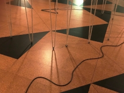
As well as showing an interest in artisanal traditions of the past, Antunes unambiguously pays homage to makers and designers, many of them women, who may have slipped into the shadows.  Their names may be used in the titles and their designs incorporated into sculptures.  ‘the frisson of the togetherness’ incorporates a floor of cork and linoleum based on a design by British sculptor, Mary Martin (1907-1969).

Discrepancies with M.M., 2017Cork and linoleum

Discrepancies with M.M., 2017

Cork and linoleum

The assurance with which Antunes weaves references to the history of the gallery and modern British art is stimulating and I left the gallery inspired by a complex and subtle exhibition and motivated to get into the studio.

'the frisson of the togetherness', Whitechapel Gallery 3 October 2017 - 8 April 2018


London Art Fair 2018

Visitors to the annual London Art Fair have an opportunity to see an overwhelming number of works of art presented by national and international galleries under one roof.

While the main fair takes place on the ground floor, younger newer galleries primarily showing the work of emerging artists, in solo and group shows, are on the first floor.  The subsidised Art Projects have a more contemporary feel and the curation and hang are often less formal.  It is here that I found work most inspiring and relevant to the development of my own practice.  I was particularly drawn to Osservatorio  by James Brooks showing with Canal Gallery.

Osservatorio, James Brooks (detail)

Osservatorio, James Brooks (detail)

I have been thinking over ways in which to map a favourite a walk and seeing Osservatorio has helped to crystallise some ideas.  It was reassuring to see intimately scaled work so effectively displayed.

Other works that caught my eye were often prints and drawings where marks of the artist’s own hand are clearly evident such as Nana Shiomi’s woodcut on Japanese paper, which has the added pleasure of the woodgrain highlighted within an otherwise uncomplicated composition dominated by the simple shape of the teabowl.

Tea Bowl Series, Nana Shiomi

Tea Bowl Series, Nana Shiomi

Untitled by Patrick Scott (1921-2014) is eye-catching for several reasons.  It is a very large print of a geometric form based on the Japanese kimono. The carborundum clearly shows the brush marks made by the artist, bringing the human touch in contrast to overall ascetic feel of the work. 

Untitled, Patrick Scott (detail)

Untitled, Patrick Scott (detail)

While the print is delicately coloured, it also incorporates gold leaf.  The use of gold leaf is another element I have begun to incorporate into my printmaking.  The discovery of this Irish artist, previously unknown to me, is timely.  The wall label included a passage from Mel Gooding’s book on Patrick Scott  giving further food for thought.

When Scott uses colour, it is always off-set by gold. Otherwise his colour is usually palely translucent - chlorophill greens and insubstantial whites irradiated by light. Gold is neither the combined spectrum of white, nor the absence of colour that is black. It is substance and when we look at gold we see pure refelcted light. It presents itself as timeless and unchanging and Patrick Scott has recovered this ancient sign and put it to the service of Art.
— Mel Gooding; Patrick Scott: A Modern Master

Presentation and curation have repeatedly come up in my tutorials and I looked out for interesting and unusual displays.  Most notable was Chiara Williams Contemporary Art showing In Times of brutal Instability by Frances Richardson, a series of post-it notes, beautifully recreated in curved wood with an added trompe l’oeil pile of carpet made of quick drying cement.  To encourage visitors to move into the stand and to view the work more closely, the gallery sacrificed part of their wall to reduce the depth of the stand.  On another stand, Gil Hanly’s photographs were simply and poignantly presented in boxes of photographic papers delicately perched two doweling rods (invisible at first glance).  The look was clean and uncluttered, focusing the attention on the relatively small photographs unusually presented horizontally.

Gil Hanly (detail)

Gil Hanly (detail)

This was a worthwhile visit, which has given me much to consider.

En Plein Air

MA Fine Art students spent a day in Alice Holt Forest run by the Forestry Commission.  Students were encouraged to bring some materials to work with and the aim of the day was to respond to the site and to think of the forest as a space in which to work, a studio outside the studio.    Alice Holt Forest feels very different to the woods I usually walk in.  The organised car park, the well-defined and surfaced tracks, designed to accommodate large numbers of visitors, feel alien and a little disturbing. 

The relief at being outdoors though is the same.  Despite the cold, it is a thrill to choose a spot and get to work.  I begin with making rubbings of tree trunks, one a yew and one a larch (I think).  The bark feels and looks very different but the differences are less marked on the rubbings. The large pieces of paper are awkward to handle in situ but the grandeur of the woods deserves no less. The resulting marks may translate into a screen print to be used at some later point.

Next up is the ball of yarn:  walking around a small group of young trees, connecting them with the yarn.  Is this wrapping?  Or connecting?  Wrapping, in the way I think of it, has connotations of celebration or adornment, as a mark of respect or wonder.  I delight in trees and take pleasure from being close to them.  In this case though, I am making connections, in space and through time, in the way of making visible something abstract. 

Blog AliceHolt1.jpg


“The thing, however, is not just one thread but a certain gathering together of the threads of life.” 

Ingold T Bringing Things to Life 2010:10


On the way back to the car park, we see Cosmos, a carved wooden sphere, measuring two metres in diameter, installed in a carefully chosen site in the forest in 2014.  The work was commissioned by The Jerwood Open Forest from joint winners Semiconductor (Ruth Jarman and Joe Gerhardt).  On arrival, we had seen the video showing how the work was produced, taking data collected over a year in Alice Holt Forest as the starting point, demonstrating the links between science and art.  It is a clear illustration of how data can be translated into an abstract sculpture, how a work of art can be made in collaboration with industry by outsourcing production.

Blog Cosmos.jpg


Cosmos looks both at home and alien in its setting.  The material is in harmony with its setting in a small clearing, acquiring a gentle patina of moss, and yet the form clearly signals its human origin.

“These sculptural forms become unreadable within the context of science, yet become a physical form we can see, touch, experience and readable in a new way. Here, humanising the data offers a new perspective of the natural world it is documenting.”

http://semiconductorfilms.com/art/cosmos/

There is something liberating in the physical activity and the somatic experience of using the forest as a temporary studio.  I plan to do more work en plein air.


Rachel Whiteread at Tate Britain

Remembering how much I had enjoyed Rachel Whiteread Drawings exhibition at Tate Britain in 2010, I wondered if I would find the current exhibition as exciting. I need not have worried.

Rachel Whiteread’s work has been much photographed but by offering visitors a view of most of the exhibition space from the entrance, the variety in scale, shapes and colour on show dispels any feelings of presumed familiarity.

Untitled (Stairs), 2001

Untitled (Stairs), 2001

Untitled (Stairs), 2001 immediately attract the eye, instantly recognizable for what they are and yet disturbing in their unfamiliar orientation.  This inside-outside, back-to-front discomfort resurfaced several times as I worked the room.  What really was I looking at?  This mild bafflement encourages closer observation allowing a gradual recognition of fine details, an awareness of the quotidian offered with a difference.

The scale of the larger works is impressive and yet here too, it was the small details I found touching.  Looking at Untitled (Book Corridors) 1997, I wanted to walk through the spaces between the book shelves.  I thought I could see the lines of individual pages. The light here struck me as odd, disturbingly eerie, so possibly I couldn’t make out that degree of detail. Does it matter whether I could or not?  I wanted to, and I felt I could.

The smaller objects offered on shelves were new to me and held my attention.  Who would have thought the inside of loo rolls could be so interesting?

Line Up 2007-2008

Line Up 2007-2008

The act of repeatedly casting the same object and presenting the results as a series, sometimes with a variation in textures and colours, calls for further investigation.  Repetition flirts dangerously with boredom.  So why do so many artists use repetition and make works built from repeated elements?  This is a question filed away under the heading of ‘What is Art?’ and one that I suspect will result in another blog post. 

I found myself puzzled by the casts of hot water bottles:  one on its own near the entrance to the exhibition and a series on a long shelf further into the room. 

Torso 1988        

Torso 1988        

Had Torso been untitled, as much of Whiteread’s work is, would I have given this piece as much consideration?  Something else to think about:  the power of a title.  I wonder why this torso is offered with the protection of an acrylic box.  Is it more fragile, more precious than other works?  Is the presentation signaling something to the viewer?  Looking at the shelf with nine casts of hot water bottles, I compared them to each other and looked for the differences in a clinical way, wondering about materials and decoration, which includes silver leaf!

The casts of doors and windows left me unmoved.  They were presented away from each other and appeared unrelated.  In the vast exhibition room, I thought of builders’ merchants.  They looked smooth and glossy and somehow devoid of character and I wonder if the lighting did them a disservice, perhaps not showing them at their best.

The works on paper were a joy and took me back to Drawings.  Looking at these, I was conscious of the artist's own hand, which appears absent in the large cast pieces which require a team of experts to create.

Suffice to say that I am looking forward to a return visit before long.

The exhibition is on at Tate Britain until 21 January 2018.