I had the opportunity recently to exhibit work as part of a group textile exhibition in St Saviour’s Church, Aberdeen Park in Highbury, London N5.
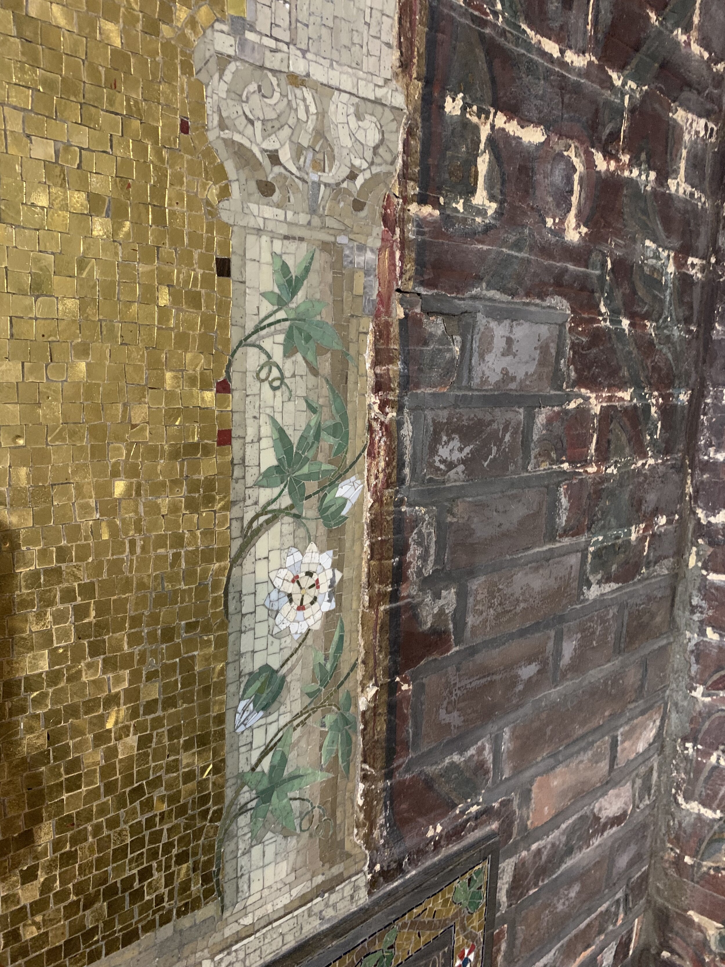
Built as a High Church refuge for Anglo-Catholics in the mid 1860s, the church interior remains to this day highly ornate. The space is an extravaganza of painted bricks, stained glass, ornate iron work, albeit in muted tones, the whole uplifted by intricate and bright mosaics of religious scenes, in complete contrast to the aesthetic of the white cube introduced in the early twentieth century. It is does not immediate appear to make an ideal exhibition space.
Brickwork and mosaics, Aberdeen Park, St Saviour’s, Aberdeen Park
The white cube as an exhibiting space gained popularity in the early twentieth century when artists, working in an increasingly abstract style preferred to remove external distractions and to focus on the colour and light in their works. The white walls can be seen as reminiscent of the white border of a photograph, acting as a frame for the work.
Brian O’Doherty wrote a series of essays for Artforum magazine, published later as a book titled Inside the White Cube. In it O’Doherty explored the modernist obsession with the white cube, exposing the tendency for objects to appear sacred and arguing that this made reading the art itself more difficult.
When the balance between exhibit and space is less skewed, the viewer needs to work harder to discover the works. The rewards however can be numerous. Unexpected elements of the pieces may be emphasised, perhaps the human scale of the construction or of the finished piece, the hand of the maker may be more evident too. The nature of the materials may be thrown into focus as they contrast with their surroundings or meld gently with them. A quiet piece may speak louder in this congenial context.
Whitney Birkett wrote in 2012 that the attraction of the white cube may have begun to wane and that viewers today are more likely to find it off-putting. Birkett wrote that the white cube “now elevates art above its earthly origins, alienating uninitiated visitors and supporting traditional power relationships.” (cited Abigail Cain Jan 2017). A white cube style gallery calls to mind the corporate side of the world, where the focus is as much on investment and financial return as on the artwork.
Having submitted two quiet pieces in muted tones to the show, I wondered how these would fare in the ornate setting. I was pleased to find that both pieces hung comfortably, hushed but not voiceless. The texture of the various strings and of the construction of the nets in particular came to life, enhanced perhaps by the warmth of the bricks and the grid of the walls.


